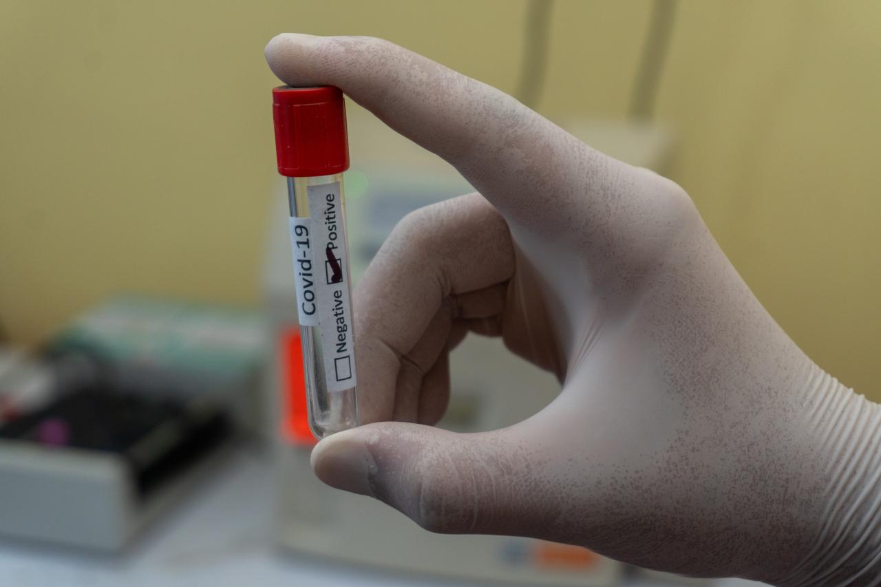
On the 26th of January over 100,000 people died in the UK due to coronavirus, almost a whole year after the first recorded death. Prime Minister Boris Johnson announced:
Discover our latest podcast
It's hard to compute the sorrow contained in that grim statistic: the years of life lost, the family gatherings not attended and for so many relatives the missed chance to even say goodbye.
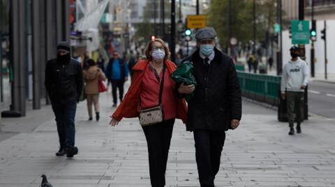
However, it’s not all bad news as 6.8 million others have managed to access their first jab. And, according to the latest data, some areas in the UK are seeing a slow fall in COVID cases. London, in particular, has seen its lowest coronavirus rates since before the Christmas period.
The data gathered by Public Health England show that the lockdown put in place on the 6th of January may finally be starting to have an impact.
How does this affect your area?
The lockdown is expected to be in place until at least mid-February, but when it comes to heading out for groceries or going for a run, many are still worried about their risk of contracting the virus.
Luckily, the government has now released an interactive map that can be used to see just how many coronavirus cases there are in your area.
The map displays weekly data for local areas which gets updated every day all you need to do is use the slider to select a specific week and enter your postcode into the search bar. However, for smaller areas with fewer than three cases, the data will not show up on the map in order to protect the identity of those affected.
Once you’ve entered your postcode into the map you’ll be able to see how many cases there were in your area within the seven day time period selected, as well as whether or not the number of cases had increased or decreased from the week prior. The map also shows the rolling rate of coronavirus per 100,000 people for the area you’ve selected and also compares this to the average rate of coronavirus cases in England.
If this isn’t enough information for you, then you can also select ‘see more data’ which will show you how many COVID tests for your area as well as the coronavirus death rates and the number of people admitted to hospital.
So, to see how coronavirus has affected your neighbourhood check here.